Type: Team Project @ LIS
Role: Board Member
The London Interdisciplinary School Student Association (LISSA for short) is a project that I helped launch alongside LIS classmates and staff in 2021. LISSA aimed to effectively manage, organise, and fund the numerous university student-led societies being founded.
The Landscape
Starting this project was an organisational challenge as societies were already forming, and their teams required support to get moving. Additionally, we had to always keep in mind transferability, as LISSA would have new board members each year – so documentation was vital.
Our tasks
- Documentation
- Branding
- Information centralisation
- Managing funding
Documentation
Our first order of business was to set up the initial documentation, which would outline the student association’s key activities and priorities – this became our Terms of Reference.
Other aspects of this document included:
- Oversight terms from the LIS administration.
- Frequency of meetings (within ~10-week terms).
- Voting parameters.
Branding
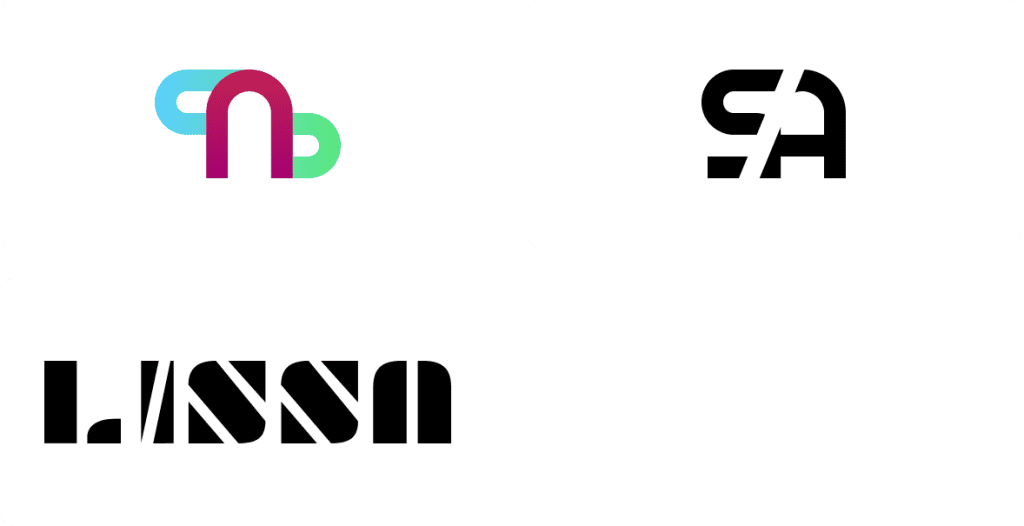
Since the student association would function similarly to a student union, we wanted to build a brand that would collectively reflect LIS students. With this in mind, Lucia Ene-Lesikar and I got to work on brainstorming ideas and designs that would best suit our needs. Some my inital designs are below:

‘I wasn’t quite happy with these designs so I wentdidn’tto the drawing board thinking ’bout something that everyone could relate to.’I wasn’t quite happy with these designs so I went back to the drawing board thinking about something that everyone could relate to.
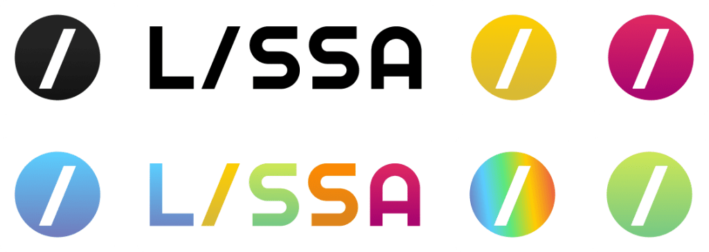
‘What stood out amongst our peers was a rich variety of interests and beliefs – they didn’t identify with one particular ‘thing’. Instead, they were talented and knowledgable about multiple things – or how we saw it: something slash, something slash, something else—for example, photographer/graphic designer/yoga enthusiast/gym rat.’
Seeing this as a common trait amongst our peers, we wanted to capture this logo’s’ and make it part of the LISSA identity.
I also wanted the logo to follow some key design rules – these were:
- Shape-focused — for boldness
- This would ensure that the logo’s shape would be bold and stand out independently of colour. To do this, we designed black and white first.
- Simple, flat iconography — for scalability
- Simplicity is key – first for recognisability and second for translatability across different mediums and sizes.
- Colour-agnostic — for variety
- This was so the logo would suit multiple colours. Since we wanted to design for a diverse audience, the logo had to work well with different colours.
The final results created a logo that was suitable to view in black and white, but also in a multitude of other colours as well.

What I learned
- Being a small team we benefited largely from the overlapping and complementary skillsets of each other. Skills in leadership, technical, and organisational were the most valuable in the setup of LISSA.
- Less heavily defined roles works better when starting up a project as we needed generalist and defining special purpose roles was counter productive when we needed more hands.
